Tuesday, 16 March 2010

Magazine Advert Analysis

I have also decided to create a magazine advert to advertise and promote the artist.

The first thing to do is to decide which type of magazine the advert would be placed in as this is very important in engaging with the target audience - it is important that the particular magazine is known to be consumed by the specific target audience the artist is aimed at as this will successfully promote them. E.g. an advertisement for 'The Beatles' printed in an RnB music magazine would be pointless as the specific audience who consume 'The Beatles' are unlikely to consume an RnB magazine and the RnB fans who consume the magazine are unlikely to be persuaded to buy anything to do with 'The Beatles' as they do not enjoy this genre of music.


I have defined my target audience as people of various ages who listen to popular chart dance music so therefore I would choose to place an advert in a magazine which these people consume - which would be a popular magazine containing information about dance magazine or chart magazine. I would also choose a magazine aimed at mixed genders as I have defined the target audience as being both males and females.

Magazines I have found that are targeted at mixed genres of various ages who are interested in chart music and/or dance music:

http://www.djmag.com/ - DJ mag is a UK dance music magazine. It seems to be aimed at both genders of various ages. However, it seems to be about the technical side of dance music therefore is probably aimed at DJs and people who are interested in music technology as it includes tips on mixing and software that includes material for DJs and mixers to use. However, it does include a Chart and Review section on the website but in looking at this I have noticed that all the music that has been reviewed is of a pure dance music genre and the artists are specifically just dance music artists and not recognised or popular names. Also, the image of the current front cover of the magazine includes a head shot of an unrecognised face, (in the charts) and he is male - and seems to be a DJ or producer rather than somebody who is currently in the charts with his face in lots of magazines - which would be the case for my artist. In conclusion, although the magazine seems to be aimed at both genders, perhaps though more male, and is about dance music it would be the wrong magazine to place an advert for my artist in as the genres of dance music are different (the songs my artist would produce are more 'chart/pop dance' whereas the music that is advertised in this magazine are targeted at people who are interested in pure dance music and more the technical aspect.) Therefore, it would be breaking the conventions of the magazine to advertise a chart/pop dance song and will probably not attract many of my target audience as they probably do not consume this magazine and the people who do consume this magazine will most probably prefer pure dance music. - Basically artists advertised in this magazine are the faces behind dance music, whereas my artist is a face of the music (celebrity).


http://www.smashhits.net/ Smash Hits magazine contains adverts and information about current artists in the charts, however looking at the website it has now combined with Heat magazine to create a similar magazine instead of previously being a magazine itself - after reading more information about the magazine I have found out that it has closed after been a victim of the rise of digital media. The website, and image of the magazine, contains the latest gossip about celebrities, interviews with current chart toppers and a top ten chart predictor. Therefore, the magazine (if Heat magazine is the 'new' Smash Hits) will contain the same type of context (as the website is advertising the magazine after all) and therefore will contain advertisements advertising similar artists to the artist I am promoting. This means that the target audience I am aiming at consume this magazine as the artists published in this magazine are chart/pop dance artists. However, the girlie colour scheme used on the website (purples and pinks) and the fact that celebrity gossip is included in the magazine suggest that it is aimed at a female audience rather than a mixed gender audience so therefore it may not be wise to publish an advert in this magazine as the males of my target audience may not see this. However, it will be hard to find a magazine which is aimed at both genders and also includes interests and genres of music that my target audience would consume. The website also seems to be aimed at a teen girl audience as the lip gloss samples and language and colours used suggest this so although the magazine seems to be consumed by some of my target audience, all of my target audience may not consume it as it seems to be aimed at teenage girls.

-In spending much more time searching the net and browsing shops I failed to find any magazine that is aimed at my specific target audience overall. Therefore I will have to create an advert for a magazine that I have 'created' myself and only use the actual artist advertisements, for chart/pop dance artists, in other magazines for inspiration and to define the conventions of these adverts to use in my own work.

The name of my magazine will be 'Influence' as I think that this is a modern, catchy name for a magazine and also connotates to the content which is in the magazine - The magazine will contain text about chart artists including fashion, gossip and interviews, including men's fashion and sport information so the magazine appeals to a male audience as well as female, and therefore these artists are being reflected to have an influence on the audience itself who will be consuming these artists in the ways in which the magazine portrays them. For example - A good review about a certain artist in the magazine about a particular album by them will encourage the audience to go and buy this album, but if it was a bad review they audience may be reluctant to consume this album - therefore creating an influence. The aim of my advertisement will be to influence the audience to consume material by the artist I am promoting.


Magazine Advertisement Analysis


This magazine advert is a full page poster advert. It is likely to be found towards the end pages of the magazine as this is usually where music reviews and chart listings are located. It consists of a large image of the artist (Madonna) performing during her tour. The colours have been edited to show her in pink, orange, black, white, yellow, blue and purple. This blends in with the background which is also multicoloured. She looks attractive and is wearing interesting clothing and looks very confident which suggests that her tour will be entertaining - which is successfully promoting the tour as people will be persuaded to go. The slight low angle also reflects her confidence and dominance whilst still being flattering. The artist's name (Madonna) is placed slightly to the lower part of the poster but is the text that is placed first and nearest to the middle of the poster overall which helps to make it eye-catching. The font itself is basic, large and rounded - creating a fun, but also eye-catching, bubbly feel. It uses the same colour scheme which is used as the image's background and overall image colour. The title of the tour is in the same font and uses the same colour scheme but is remarkably smaller in size, therefore ensuring that the name of the artist is most eye-catching - which immediately draws the audience to the poster as they will see the name of the artist (who they supposedly will like) first and will be drawn to read the rest of the poster (basically, the name of the artist is the most important piece of text as it will be this that attracts the audience as well as the main image.) The name of the tour, 'Sticky and sweet', links with the colour scheme as the colours are like 'sweet' colours. The vertical and horizontal lines used create a unique, unusual, and together with the colour scheme and image, an 80's 'disco' feel which is important to note as Madonna was really well known in the 1980's and her music is usually dance or disco music. The rest of the font is placed in front of a black background, which is placed overall to the bottom of the image. The rest of the font is in white and yellow so it still stands out over the black background but also does not direct the audience's attention from the artist name and image as this font is smaller and not multi-coloured, just basic white and yellow. Logos of websites, TV companies and radio companies are placed in a line which reflect the fact that it is a magazine promotional advert. Text containing the website is also placed underneath this to promote the website which will obviously give further details about the tour. A small image of her album cover is placed to the left of the poster. This advert would probably be found in similar magazines as to which my artist's advert would be found in - chart music, gossip and dance music magazines such as Heat magazine and Closer magazine.

Overall I really like this poster as it is eye-catching and bright. It really reflects the genre of the music as being fun,bubbly, disco/dance and light-hearted. This colour scheme and overall idea however would be too bright and 'cheerful' looking for the song that my artist sings in the music video and probably all her other music, but I could use the idea of different colours and fonts reflecting the genre of the music in my own work and I will aim to make the artist as attractive as possible to appeal to the audience.


This magazine advert also uses the multicoloured colour scheme but this time with the artist in front of the colours, not engaging with them in any way. The artist is stood, obviously outside -suggested by the grim building he is next to, wearing a plain black jacket and dark jeans - also suggesting he is outside - in the night looking very serious with his hands in his pockets. He is not engaging with the audience in anyway as he is looking away from the camera but because of his serious stance and serious expression the audience are attracted to this image, wondering why he is so serious. This also suggests what the music is like - probably slow, serious and meaningful. The overall image takes up the full half page and again the advert would probably be found towards the end of the magazine near where music reviews and chart lists are usually placed. The main text is, like previously, the name of the artist - it is the largest text and placed at the top of the image therefore showing this. The font itself in in white and a stencil/army type font which also reflects the serious mood. The white colouring ensures the text stands out against the background. The other text is placed underneath the artist name in smaller font to
the bottom left of the image and is also in white to ensure it stands out. Text includes a website to view and a telephone number to call for more information of the tour and how to book tickets to the tour. Overall, the serious dark mood of the image is made to stand out and be eye-catching using the multicoloured lights. This advert would probably be found in a more indie magazine such as NME, or a magazine aimed at older people as the serious feel reflects this idea.

Overall I think this advert reflects the mood of the genre of music sucessfully in the artist's stance and expression but because of the dark colouring in the background and the artist's costume the artist does not stand out as much as he should which would catch the audience's eyes more. I also think that the advert should be larger to ensure it is more eye-catching, especially as it lacks in the artist being eye-catching and lacks a fun, exicting feel. I feel that the advert almost makes the tour seem boring as it is too serious and not a very exciting image, but then again the advert is probably aimed at a more mature audience.


This magazine advert looks cool and breezy. Again the name of the artist is dominant - placed at the top of the image in the largest font. The font colour is a palish blue colour and reflects the 'cool' and fresh feel of the advert. However, the font used is elegant and old fashioned which ensures that is visually pleasing to look at and adds a classy feel. The rest of the font is remarkably smaller and is placed in columns to the right of the main image and underneath the artist's name. The places of the tours are in the same colour as the artist's name making them stand out more than the not as bold black font with phone numbers underneath these. The font underneath this to the bottom of the image is also in black and in even smaller print - which includes phone numbers and website addresses which will be used to book tickets for the tour and view more details of the tour. At the bottom of the advert a blue bar, the same colour as the artist font, stretches along the bottom with text informing the audience that 38 tours have sold out (in black and white font to stand out) - this is a method used to 'panic' the audience into buying tickets and also reflects how popular the tour is making it seem an exciting, cool and popular place to go to. The image of the artist (Peter Andre) shows him sat coolly on a pure white chair - suggesting he is wealty as the chair looks expensive. He is shown looking visually attractive with his white shirt - which also links in with the colour scheme and 'cool' feel to the advert - unbuttoned at the top to show a toned, tanned body. He is looking to the right, not at the camera (not engaging with the audience) with a 'sexy' expression with narrowed eyes. This draws the audience in as they are curious to find out more about him - as the fact that he is looking away from the camera in such a way makes him seem mysterious. The image of him fades subtly into the pure white background. There are two smaller images of two albums that can be comsumed by the artist at the time of the advert therefore advertising the album.

Overall I think this advert reflects the cool, RnB genre of music which Peter Andre releases. The whole feel of the advert is breezy and cool because of the pure white background and light blue colours. It is a reffeshing and eyecatching advert and does not specifically advertise one of his songs alone but him as an artist and his music overall. I could use the fact that colours and space are used to create the feel of the music in my own work - considering what colours and shapes I would associate with the artist's music that I am promoting.

Conventions

In analysing the magazine adverts I have defined conventions which I will use in my own work:

* Large dominant photo of the artist.
* The colour scheme and fonts used reflect the genre of music the artist releases.
* The name of the artist is the largest text and stands out.
* The artist looks as visually attractive as possible.
* The websites of the artist and/or the tour dates are included.
* A contact number is included for booking tour tickets.

Making Of The Cover And Final Result


The following post reflects how I created the cover in different stages, what software and methods I used and the final product.


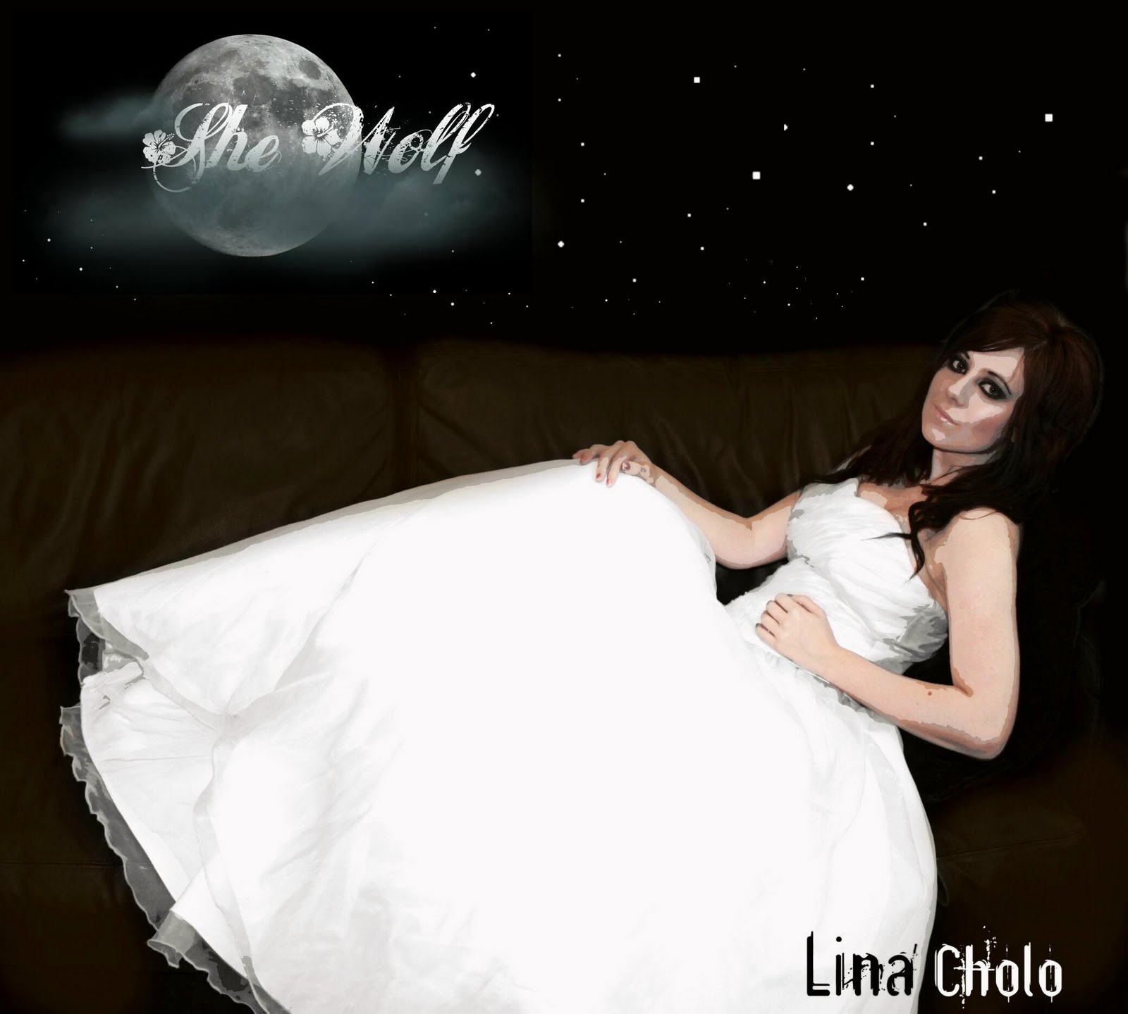
I decided to use this image for my album front cover image. The reasons are because the angle is just right, the pose is flattering and although the lighting isn't perfect, it is easy to modify this. The artist also looks as attractive as possible which is an important marketing trait in attracting the audience as they will either wish to look like the artist of be attracted to her, persuading them to consume the album. Also, the background of the image is plain which makes it easier to change into black - the colour I planned for the background colour. The image is exactly the image I had in mind for the album cover - I ensured this by planning ahead and thinking of the suitable, accessible location early. However, the outfit I used is different from what I planned as when looking through my wardrobe I found the dress I wore to my school prom which is elegant and beautiful - exactly the kind of look I wanted for my album cover. I think it works well and creates exactly the right 'feel' to the image.


Stages Of Creating The Album Image

1. Firstly I uploaded the image onto a photo editing website called Picnik. I could have used photoshop for this but I am more familiar with Picnik so therefore thought it would be easier, and quicker, to use this.

2. I used the cropping tool to crop the image to where I wanted. This ensures that the parts of the image i did not need would be cut out and also ensures that it is the correct shape.

3. Next I used the 'doodle' tool to colour the background black. I changed the size of the brush accordingly and blurred the brush slightly to create an even, neat finish.

4. I then used the black and white tool to change the dress and sofa into black and white. To do this I used a brush tool to go paint over the parts of the image I wanted to be in colour.

5. Next I used the exposure tool to change the contrast and brightness to where I thought it looked the best.

6. After using the sharpen tool to add sharpness to the image I saved the image as a high quality JPEG file.

7. I then opened the image into a program called 'Ulead Photo Express' which I am very familiar with.

8. I pasted an image of the moon onto the background of the image to the left, like planned.

9. I then downloaded various fonts from the Internet to try out the artist's name. After choosing the most attractive font I placed and coloured the text accordingly.

10. I used the 'selection' tool to select various snippets of grey clouds and placed these over the moon and over the text to create a misty, eerie feel. I changed the selection tool so that the edges were not sharp and straight but blurry and smudged therefore making the clouds seem realistic.

The Final Image

Here is the final image of the album cover. I am happy with it as I spent a lot of time ensuring every step I took to creating it was done taking time and care. I spent a lot of time experimenting including moving the image of the moon around and the text around to see what would look the best. Small things like such can be very effective.


The image is almost exactly the same as what I had planned and drafted. The dress the artist wears ensures elegance and connotates to her femininity and beauty. The artist looks attractive but the image overall is 'cartoon/fiction like' with the moon been so large and prominent so the posterise effect used to make the artist look slightly 'cartoonish' is effective overall as it also reflects the song - she-wolfs are fiction and the cartoonish effect emphasises this. I particularly like the image of the moon and clouds with the text as I think this is very effective in ensuring a creepy, mysterious atmosphere and looks attractive. Overall, I think the album cover would be successful in marketing the product as the image is unusual and elegant, portraying the artist as
being an attractive woman. The overall image reflects the genre and ideology of the song well - the dark lighting, full moon and white 'ghostly' dress are typical of the horror genre.

In creating the rest of the album cover, the back cover, spine and the inside - I studied the conventions of other album covers which I found to be all the conventions I have written on my drafts: The name of the songs on the back of the cover, the producer name, a website, adverts inside the cover.. I also made sure I used the same colour scheme and feel in the rear image and the inside images.

Images Taken For The Album Cover And Advert


Here are the images I have taken for the front image of the album cover, the mobile phone advert and the close-up image inside the cover (underneath the where the disk is placed.)

<< -- Here is a screen shot of all images taken for both the album cover and the advert:


The following images are the ones I chose out of all of the images that I thought would be suitable to use:


Thursday, 4 March 2010

Album Cover Drafts

To begin with I drafted a couple of basic design drafts of the album cover overall in the promotional pack. From these drafts I will choose one as a rough guide for creating my album cover.


Conclusion

I decided to choose the last draft design as it includes the conventions, which we know of as consumers, of album covers such as the advert for mobile phone wallpapers etc, the large image on the front and the close-up of the artist underneath the CD holder. I also like the fact that the text on the back cover is centered therefore it looks neat and attractive.


I have drafted out a few ideas of my own for the specific CD cover image, with the conventions of other CD covers taken into consideration. Out of these drafts I will choose the one that I think will be most appealing and effective with the audience and then use this draft to create the final CD cover product. By drafting out some ideas I am able to put thought into what exactly I want my cover to look like. As well as drafting out the cover plans I have also drafted out a few front cover image ideas as well, to ensure that the best, and most effective image possible will be used.

However, before I did this I needed to choose a name for the artist. I brainstormed possible suitable names ranging from 'retro/cool' to elegant:

Cherry
Stripe
Fierce
Sky
Skie
Zsha Zsha
Mimi
Star
Dixie
Lola
Cha Cha
Za Za
Stiletto
Blu
Imperia
Illusion
Zoowie (Pronounced Zoe)
Azure
Echo
India
Liberty
Kimora
Meera
Willow


Cocoa Zañita
Aña Aqueña
Junetta Mibella
Chiprialla Iba
Letizia
Zoeyette
Lina Cholo
Cody Brooke
Sofia Maria
Selena Lucia
Marina Der-chi
Miguel Alejandro
Alita
Jovetta
Inocenta Cruz
Danisha Diamante
Zuza
Villana
Kezia


Obviously the name of the artist will have an impact on what the images for the cover look like as if the name is elegant the images will represent the artist being element and if the name is sharp and cool the images will be sharp, retro and bright - to represent the artist.

To see what would really look the best I have ensured that I include a mix in the covers I draft out.


- This draft I created is aimed to include the overall theme of the song. A beautiful woman - the 'she-wolf' - is sat on a log in a dark, creepy forest with the full moon visible through the trees. She is wearing a flowing dress which is rippling slightly with the wind. Her facial expression would be serious and appealing, to draw the audience to this cover. The font I have used is 'fancy' and elegant, as well as the artist's name on this cover - which is an elegant, exotic name to fit in with the style of the cover. I like this design as it is elegant and the wood setting also links in with the theme of the song. I also like the fact that the artist is portrayed as been beautiful and elegant but her costume is not too revealing so therefore she is sexually appealing as she is pretty but she is not seen as too 'sexy'. It is also very similar to the 'Shakira' album cover I have analysed in the previous post, and Shakira is the original artist of the song.


- This draft captures more of the artist's sex appeal as she is laid out in a sexually appealing pose wearing a short dress and silver leggings. She is laid on a dark sofa which is part of the actual video itself. There is the sky above her with stars and a moon visible. The artist is looking up at the full moon, which links in with the 'werewolf' theme. The colours are dark and gloomy, like a horror movie and the artist's face is illuminated by the light from the moon which gives priority to her in the frame and draws the audience's eyes to her. The artist's name is elegant, to link in with the image, and to reflect this I have used an elegant font for the song name and a simple, modern but classy font for the artist's name. I like this design as it is so unusual and although it is not bright in colour - a technique usually used to catch the audience's eyes - it is unusual enough to catch their eyes and is visually appealing as it is more interesting to look at than most over covers. The image is also featured in the music video itself which is a good promotion technique as the audience will remember this image and immediatley link the image to the video itself.


I drafted out a few other drafts, which are slightly different from the previous as I created them with an edgier name for the artist in mind, therefore the cover reflects this as I think the cover should reflect the personality of the artist as whole to attract specific target audiences.

The idea of this cover image is that the image links in with the artist name - which is 'Stripe.' The
stripe which is placed to the left and in front of the artist's face links with the artist name. I have chosen to show only an extreme close-up of the bottom of the artist's face to create a sense of mystery - as you cannot see the whole of their face - and to also focus on their lips which would be coloured brightly to add a 'sharp' bright feel to the image and to also add sex appeal. The background is plain white therefore focusing the attention on the artist's face and also creates a modern feel. The whole image is modern and sharp, but does not really link with the song in any way apart from the sense of mystery created by only the bottom of the face been visible. It is also a basic image and may not attract the audience because of this.


I have also used the name 'stripe' for the artist on this cover, as I decided it was a sharp and modern name. This cover image consists of 'stripes' placed in different places to split the image up into pieces. Different parts of a main image of the artist's face are scattered around these stripes, as is the letters of the artist's name. The background colour is different for every section. The image overall is different and unique but may also be a little too confusing for the audience as the artist's name is hard to read and the different parts of the image scattered around also create confusion.


In this cover draft I have used the same sort of idea as the first 'Stripe' draft, using the bottom of the artist's face with a plain white background. This image also links with the artist's name, again like the 'Stripe' covers. The cover consists of an extreme close-up of the bottom of the artist's face with their mouth open and biting on a cherry. I have used the colour of their lips to stand out against the white background to create a sharp modern feel. Their lips would be the same colour as the cherry and their skin as white as possible to emphasise the colour and make it stand out. The idea of using the cherry with the lips creates sex appeal but has nothing really to do with the song and merely links in with the artist's name. Also, the image itself is basic and perhaps not enough to capture the audience's eyes.


Conclusion

In conclusion, in my opinion, the first two cover designs are the best to use as they both link in with the song, look 'classy' and 'elegant' as well as using the conventions of the genre of the song and are both eye-catching and unusual. The last three cover designs are good ideas but do not link sufficiently with the actual song itself, just the artist, and therefore will not attract the audience as well as they should do and do not fullfill their expectations of the cover image linking with the song - which could sometimes work if the cover image is strong enough - but these designs are too basic to carry this off.


I personally think that the second design would be the most effective out of the two that I chose as it uses an actual image from the video therefore the audience will link this image to the video and remember it when viewing the video, therefore creating a strong subconcious impression. the image uses the conventions of the genre of music - as the artist is dressed in revealing clothing as do artists promoting dance music and in dance music videos. It also uses the conventions of the ideology of the song as a whole as it inlcudes elements of horror - the full moon and dark colours used. It is unusal and eye-catching which will attract the audience. The artist should look as good looking as possible so that it fullfills both of the target audience's needs - Males will find her sexually appealing and females will wish to look like her and may then even begin to copy her style and look from this image - use of narcissism as females will see her as an idealised image of themselves and adopt certain aspects of the artist.

* Name of the artist *

I decided on using the name Lina Cholo as it is elegant, exotic and sounds pleasant therefore it links with the elegant ideology of the album cover and also with the personality of the artist as I imagine the artist to be exotic and from a beautiful country such as Spain and also elegantly sexy and I think this name portrays this ideology well, therefore will attract the audience.

Friday, 12 February 2010

Front Cover Analysis

For one of the ancillary texts I am going to create a cover for the case my music video would be marketed in. To do this it is important that I analyse various album covers of artists that would interest the people in my own target audience range to ensure that I have enough ideas and knowledge for my own product to look attractive and eye-catching but to also appeal to my target audience.


The first cover that I have chosen to analyse is Shakira - Oral Fixation. I have chosen to analyse this as the song I have chosen to create a music video for is by the artist Shakira and therefore analysing her album cover will give me a useful guideline as to what sort of image would go with a Shakira song and will also be attractive to the target audience.


The image consists of the image of Shakira holding an apple wearing little make-up, little clothing but some leaves. This image is a well known image that is portrayed in the biblical story of Adam and Eve. In this context Shakira is being represented as Eve. There is also an image of a baby sat in the tree reaching towards her, looking as if he/she is fixated by her. This links with the title of the album. Shakira is to the centre of the frame which suggests she is dominant, which is true as she is the artist. She looks beautiful in the image although her hair and make-up seem natural, reflecting that she is a 'natural beauty' - like Eve in the story of Adam and Eve, although the outfit she is wearing adds a sexual feel. In the background the sky is cloudy with a little sunlight reflected on the cloud at the top left of the frame, behind the text that says Shakira and the album name. The font used is an old Gothic type font which goes with the ideology of Adam and Eve that is used. It is red in colour which matches the apple Shakira is holding therefore creating a vague colour scheme of reds, browns and greens. The overall style of the image is painting like and slightly 'dull' in lighting therefore reflecting the time of Adam and Eve which the image is obviously based around.


I have chosen to analyse The Fame - Lady Gaga as Lady Gaga is a contemporary artist who has released music that my target audience would probably consume. The cover consists of Lady Gaga's face as a close-up with a serious expression, airbrushed, wearing sunglasses and make-up. Lighting is used to create a shadow on the left side of her face which gives the impression of something mysterious and unusual. The shadow adds more meaning than a basic full front image of her with no shadows. The black colours used and shadows - plus the dark sunglasses create a sinister look. However, the black and shadows are mixed with the images of diamonds that cover the left half of her sunglasses which creates an image that reflects wealth and glamour. The artist's name, Lady Gaga, is printed underneath the image of her face over the black in a simple font. The name of the album, The Fame, is printed on her glasses in a slightly more fancy font but still simple.


I decided to analyse the cover of Madonna - celebration as Madonna is extremely well known and is a possible choice of artist that my target audience could like. The cover consists of an image of Madonna's face close-up in the style of Andy Warhol's famous Maryln Monroe image. The colours are bright and therefore stand out and also create a fun, punky feel to the image which possibly suggests what the music is going to be like. Above the image of Madonna's face the text is placed that states the name of the artist and album name. The font is 'punky' and also in bright colours which stand out. The 'paint like' splodges that are placed near to the text also create a punky feel, as if the text has just been thrown on carelessly. Overall, the album cover is simple and does not appear to have a meaning but it stands out because of the bright colours - which also suggest what kind of music will be on the album. The fact that a hugely famous image has been used for the foundation of creating this image for the album cover also helps it to stand out as the public will recognise this iconic image. The fact that such an image has been used also suggests to the audience that Madonna is iconic, as is Maryln Monroe who featured in the 'original' painting.

http://www.artquotes.net/masters/warhol_andy/turquoise-marilyn-62.jpg -> Andy Warhol's image of Maryln Monroe that the image of Madonna is clearly based on.


Finally I have decided to analyse an Evanescence cover. Although They do not fit within my target audience of people who like dance music the cover is Gothic and the particular song I am creating the video for is about 'She-wolves' which can be seen as Gothic and slightly creepy. Also, the main singer is female as is Shakira.

The cover consists of an image of a door opening with clouds visable behind the door with sunlight pouring through. The door frame itself is elaborate and Gothic and the door visually looks heavy, like a church / cathedral door which also adds to the Gothic feel. The fact a door is used links with the album title which is 'Open Door.' The text is in a cream colour and to the right of the frame, over black which is the wall - so the text stands out. The logo of the band 'Evanescence' is the larger text and the album name is smaller. The text is in an elaborate Gothic font, which is the font always used for the band logo. Both text are surrounded by elaborate swirls and spirals, which are also seen to look Gothic. The artist in the image is shown as very pale with black hair, which is always associated stereotypically with goths. She is wearing a beautiful old fashioned looking white dress which also reflects the 'Gothic feel.' She is facing the door with the dress trailing behind her as if she is walking out the door, however she is looking downwards over her shoulder, which enables us, as an audience, to see her face clearly and her expression which is serious, calm and possibly slightly upset.


Conventions and my own work

From analysing the album covers I have learned that conventions consist of: the name of the artist and album are clearly visible, the artist is featured on the cover and the lighting and images used on the covers are carefully chosen to represent the genre of music which the album contains. Obviously, conventions are sometimes broken but generally these stand.


In my own work I can use my knowledge of the conventions in creating the cover image. I will try to ensure that the image I use reflects the genre and 'feel' of the music it contains. I will also definitely use an image of the artist as this is a popular convention. In portraying the character I can either go for the 'sex appeal' look, as the Shakira album I studied does or go for an alternative look, or even both. The genre of the music is dance but the lyrics of the song suggest a 'horror' even 'Gothic' type feel. My main aim is to create an image that is pretty, classy and 'girly', sexy and with a Gothic feel as this takes into consideration the 'feel' of the song and both genders of the target audience: Pretty, girly and classy will appeal to the female audience and sexy will appeal to males.


I also need to design the inside to the cover as it will open out to fit inside the case. In doing this I should consider the chosen colour scheme and style of the cover image.


The Music Video

To ensure that shooting my music video runs smoothly I have created a storyboard, a prop list, location list, cast list, health and safety regulations and a shooting schedule. Although this has been time consuming it has ensured that the shooting of my music video went well and that it ran smoothly.

Storyboard

This is the storyboard I created for my music video. It is a basic draft of ideas pulled together to create a good plan for creating my music video. Please note that I haven't noted the timings of the different shots as the timings in relation to the music are seen clearly during the animiatric and this gives a better insight to what the final product will look like. Also, I have written where certain shots have been repeated as identical/similar shots are sometimes used. Obviously with the storyboard when I come to actually editing the video I may have time to experiment with different ideas so I cannot yet say if the storyboard is going to be exactly like the music video but it will certainly be similar.


The actual narrative of the storyboard is based on the lyrics of the song and the narrative of these lyrics. It shows a young woman in a domestic environment trying to please her partner by commiting to staying in and completing 'woman's' chores such as baking cookies. However, she has a wild, sexy side to her which she is desperate to embrace. She does this by entering her closet at night, when her partner is asleep, and transporting magically from the closet to a world where she can be what she pleases. Shots show her laid on a dark sofa looking sexually appealing, dancing to music in a club and peeping around the door of the closet wearing little clothing. With this storyline I also needed to link in the title of the song - She Wolf - so I used shots of her -rather meanly - getting ready to eat a rabbit (as wolves do) , a shot of a silhouette of a wolf's head and a shot of the moon. I also used a 'wolf' mask in some shots to emphasise this ideology more. The conclusion of the narrative is her emerging from the closet again, while her partner still sleeps, and climbing back into bed with her secret safe.


Prop List

The props I used for the music video were chosen practically as well as imaginatively. Although some props would be impossible to use I think that I have done a good job of 'making do' with the items I already own or items that I was able to make.

The prop list I made before creating the video:

Tray
Plate
Cookies
Rabbit
Sofa
Bed
Oven Gloves
Mask (wolf)
Cupboard
Outfits - Inc. dress
Make-up - (different 'looks' for different styles)
Red Lipstick
Pole
'Clubbing' lights - disco ball, strobe lighting
Cage OR mesh to look like a cage
'Beer' glasses
Blonde Wig
Bottles OR cans of alcohol - used in bar scene
Stool
Torch
Book
Pen

I made sure that I had these props handy for the days of shooting, although I did forget about the cookies which was a small mistake. However, I decided to use biscuits instead, which kind of ruined the idea of the character been a 'domesticated girl' and baking her own cookies but in the actual shots it is hard to see them anyway so it doesn't really matter too much.


Location List

I chose my locations carefully, taking into consideration the overall 'feel' of the music video as well as the narrative - but again I had to be practical as well as imaginative so I used the best locations I could which fit the narrative and feel of the video. I chose my Auntie's house to shoot the bar scene ( my Auntie has a small bar/games room joined onto the main house), as stated in previous posts on this blog, as the setting fits in perfectly with the style of the video and I hoped originally to shoot in a bar as the narrative, told by the lyrics, includes her 'staring across the bar.' The lighting there is dark and moody, with the bar including red, brown and black colours - the perfect atmosphere for my music video. Plus items such as the bar pumps found in pubs, beer glasses and bottles of alcohol are already there - as well as a bar stool which I thought would be a good prop to use.

For most of the shots I chose to shoot in my house - as my aim was to create a 'domesticated' atmosphere which the girl is trying to escape from, as this is what the narrative of the song is trying to reflect. I have most of the props I wanted in my house already, plus access to make-up, different costumes and an area to change into these costumes. The interior of my house is modern decorated - perfect for the 'modern, domesticated' feel I wanted for the video - the girl in the song is young and therefore will live in a modern decorated 'basic' house with her partner. I also have a dark leather sofa which I knew would be perfect for the shots where the character is laid on the sofa. There is also a large wardrobe which I though would be good to use in the 'closet' shots, and I myself own strobe lighting lights and disco balls which I found I could use for the shots where she is in a club dancing as, with the correct lighting and room used, it was easy to pull off the idea of this in my own home rather then having to film in an actual nightclub which would have been dangerous as I could have ended up dropping or losing the video camera, as well as it been impossible to bring a tri-pod there. My rabbit, who I wanted to include in some shots (as the theme of the video is about a wolf - an animal who hunts rabbits) is also, obviously, easily accessible at my home and I could also ensure that she was comfortable and not in any danger or harm during filming.


For the outdoor scenes that are set in a 'forest' setting I decided to shoot some at a local 'forest' area to me - Little Switts which is located on Hessle Foreshore near the Humber Bridge. It really is perfect there for the atmosphere I wanted as it is just like an enchanted wood - dark as the light is blocked from the trees, creepy because of the vast amount of trees and there are a lot of unique features such as the footpaths that lead to a lake etc. It is a beautiful setting but slightly eerie - connotating to the ideology of the narrative of the 'She-wolf' being beautiful but also a creepy 'werewolf' too.

I also used the green area outside my house for some of the exterior shots as there are trees, leaves and bushes that would be great for creating the eerie atmosphere I wanted. I also used the library outside my house as the walls are white and surrounded by grass, trees and plants so it also made a great creepy location.

Health And Safety

I had to take health and safety into consideration when shooting my music video to ensure that nobody got hurt on the days of shooting. I firstly made sure that there was an ample amount of space around the camera- enough for a person to easily walk around it. This was to prevent people knocking the camera over and also tripping over the tripod. I made sure that there were no other hazardous objects that people could trip over as well and made sure that the floor was clear. I placed trays, glasses and any other props carefully so prevent somebody knocking these over - especially anything glass as shattered glass is very dangerous. I made sure that an extra person who was not involved in the shooting was nearby at all time in case of emergencies, and made sure that a group accompanied me to Little Switts (the forest location) for safety - people could be lurking in the trees etc. In the shots including my rabbit I ensured that I had somebody on hand to ensure safety and comfort for her - e.g. in the scene where she is in the tray I had my Mum on hand to catch her in case she tried to jump off the table and would then hurt herself. I ensured all wires joined to the 'clubbing' lights were out of the way to ensure nobody tripped over these and I also warned nobody to touch these when in use as they can get very hot.

I also ensured that anyone involved with the shooting had something to eat and drink and had a break for this, I used the heater in my Auntie's bar for warmth (as it is very cold in there) and I had a thick jacket to wear before and after shooting in Little Switts as it is very cold there at this time of the year (March). - These are not health and safety steps but they ensure comfort during the shooting of the video.

Cast List

I chose Claire Smith to star in my video as the bar maid and the she-wolf during the bar scenes as I thought she would be perfect to act out the narrative. I also thought that it would be easy to create different looks by using make-up and hair pieces/wigs and masks on her. She also has access to get to my house easily through transport therefore I was confident that she wouldn't let me down when the shooting was planned and was sure that she would arrive on time with the clothing I had asked her to wear.

I myself acted the part of the she-wolf for the majority of the video which proved very difficult as I constantly had to take test shots using the video camera to check that I was correctly positioned within the frame and that the lighting was right. I also had to press the record and stop buttons myself which meant moving backwards and forwards a lot of times. I planned to use Claire for the whole of the video but this proved impossible as with her work commitments and the time she needed editing her own work meant that it was hard to find a time to shoot that worked for both of us. However, there were advantages in using myself as I could spend more time on perfecting outfits, I was in my own home for the majority of the shooting - which ensured I was comfortable and I also had access to all my make-up/hair accessories.

For the rabbit character I used my pet rabbit Snowy - I have two rabbits but thought that she would be best fitted to the role as she is fluffy and white and smaller than my male rabbit. She fit the role I wanted perfectly as I wanted to rabbit to look sweet, cuddly and girly - which she does. I also had to consider the practical side of this but I came to the conclusion that she is well behaved and has the perfect look that I wanted.

I chose my younger brother to act as the male as the end of the video as it didn't matter that his face looks younger as I never planned to show his face in the video and therefore just his head is visible. It was also more practical than choosing somebody else to act this out as it would mean getting them to my house for just one shot.

Shooting Schedule

I created a shooting schedule which consists of the dates I plan to shoot, the location I plan to shoot at and the time it will take. This ensures that the shooting runs smoothly and by choosing dates in advance also allows me notice to choose alternative dates if the dates and times I have planned are not able to use if something else comes up which is more important e.g. family issues. In choosing the dates and times I have to ensure that it is a convenient date and time, taking things like transport and work commitments into consideration and I also need to allow more time than anticipated in actually shooting the footage as mistakes and problems often happen. I should allow, at a minimum, at least double the amount of time I think the video will take to shoot. A break for dinner should also be considered.
I am a little behind with shooting as it was hard to find a time that was suitable to shoot and when a camera was also free to use. It was also hard to ensure cast would be present at the time of shooting. I have, however, allowed enough time to edit the footage during my time at college and I have also made progress on my ancillary texts when I have not been able to shoot.


My Auntie’s Bar:

Date: 27th February
Time: 12.30pm – 3.30pm


My House:
Dates: 2nd March , 4th March
Times: 5.30pm – 8.00pm (Both Nights)


Little Switts:
Date: 6th March
Time: 2.00pm – 3.30pm


Costumes

Each costume I have used in the music video has been chosen for a reason and to reflect a certain kind of personality of the character. Therefore i will discuss this in relations to the shots in the music video:

How Effective Would You Say My Product/Products Are At Advertising The Album?

How realistic does my product/products look?

How well do you think my product/products overall reflect the genre of music I have chosen (Pop/Dance) ?

What genre of music do you consume the most?

What would your reaction be in viewing my product/products?

Followers